Dealmed
A Digital Home Worthy of the Dealmed Name

Dealmed is one of the leading names in the medical supplies distribution industry, known for servicing facilities across the healthcare spectrum. Well-established and with a stellar reputation, Dealmed carries a huge range of medical supplies, from band-aids to ultrasound machines. It would be difficult to find a healthcare facility without products sporting Dealmed’s signature red logo.
The Dealmed Challenge
When Dealmed approached Forwardslash, they already had a functional website. The problem? Their website wasn’t performing well, and not leading to enough sales. We pinpointed a few reasons for this:
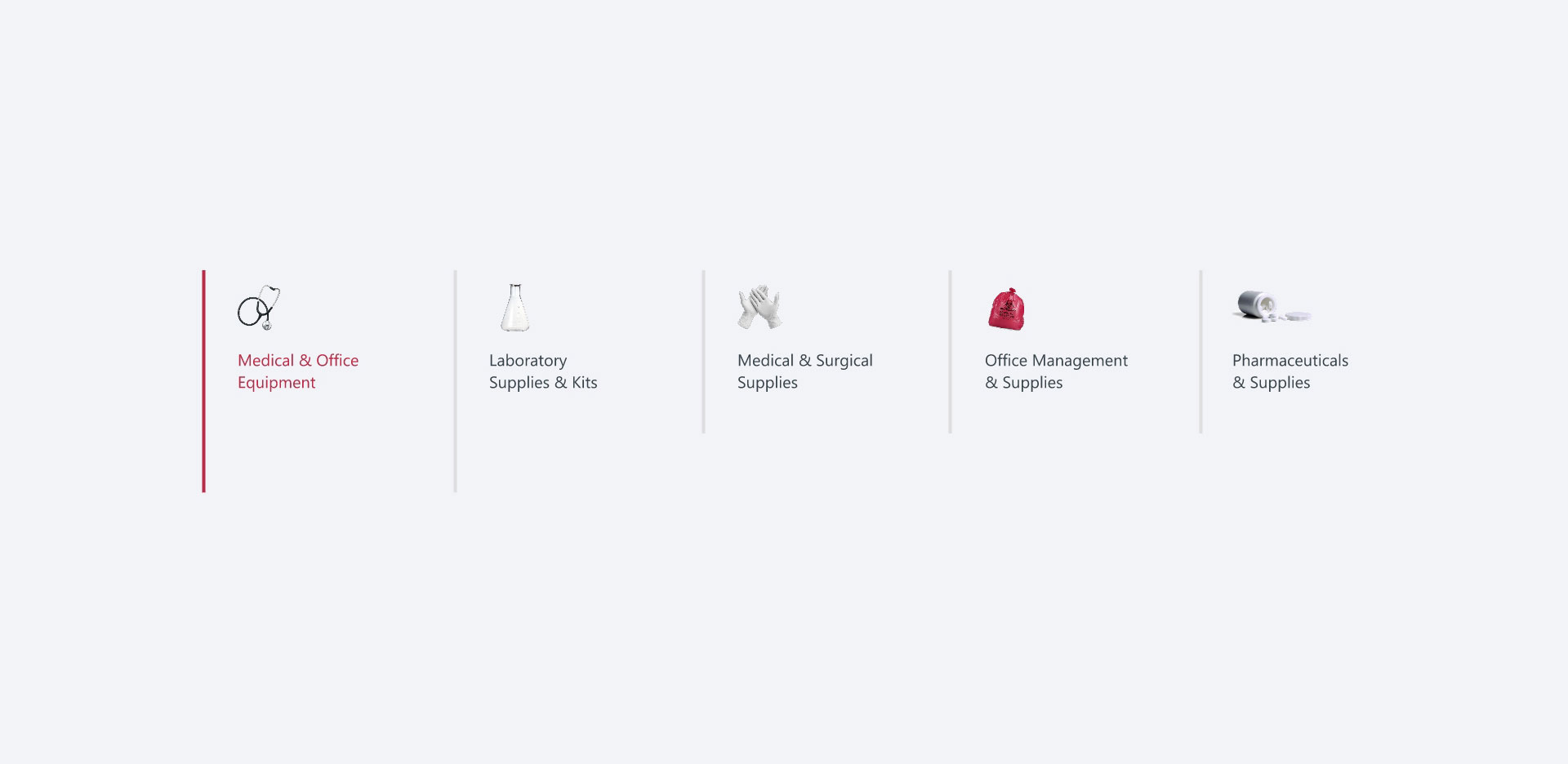
1. Lack of clarity in service offerings: Dealmed had started off as a fledgling company whose growth exploded at a tremendous rate. Trying to provide as much value as they could, they were responding to every client request and had never actually formalized the list of services and solutions they offer. This led to ambiguity and confusion in their messaging and navigation. Their list of services needed to be refined and organized in an intuitive way – both for internal and external purposes.
1. Lack of clarity in service offerings: Dealmed had started off as a fledgling company whose growth exploded at a tremendous rate. Trying to provide as much value as they could, they were responding to every client request and had never actually formalized the list of services and solutions they offer. This led to ambiguity and confusion in their messaging and navigation. Their list of services needed to be refined and organized in an intuitive way – both for internal and external purposes.

2. Lack of verbal brand identity: The website didn’t feature branded language and messaging or a consistent, recognizable voice – crucial to standing out in a crowded market, communicating with crystal clarity, and engendering trust.
3. Poor UX: If customers can’t find their way around easily, even the most expertly-built website will be exited in seconds. This is especially true for a market leader like Dealmed, which carries thousands of products.
4. Poor UI: The design wasn’t particularly modern, sleek, or appealing to customers. An outdated design can easily turn off site visitors within seconds.
In short, Dealmed’s site didn’t reflect Dealmed’s respected reputation in the industry – and this had to change.
Diving into their brand identity
First on our list was developing Dealmed’s core messaging. In order to do this, we had to first gain a thorough understanding of Dealmed's identity and their position in the marketplace. Among a sea of other medical suppliers, they certainly weren’t the first or the biggest. So where did they fit in? What value did they have to add to the industry? What market gap did they fill?
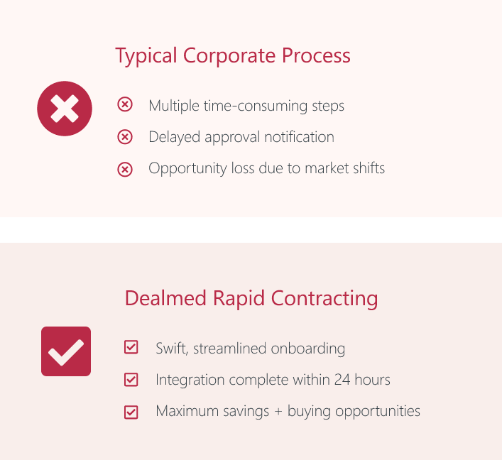
Dealmed stood out from the competition in a singular way, and our job was to capitalize on that. The other medical suppliers – behemoths of the industry – are all similar in a few ways: They have sluggish response times and low flexibility, with little room for client patronage or pivoting. Dealmed’s 24-hour response time and customer-centric model is unique among a crowd of old-school giants who insist on doing things the “good old way”. Dealmed acts as a highly agile “first responder” who always puts the customer first – and the messaging, voice, and tone we’d create would have to communicate that flawlessly.
Dealmed stood out from the competition in a singular way, and our job was to capitalize on that. The other medical suppliers – behemoths of the industry – are all similar in a few ways: They have sluggish response times and low flexibility, with little room for client patronage or pivoting. Dealmed’s 24-hour response time and customer-centric model is unique among a crowd of old-school giants who insist on doing things the “good old way”. Dealmed acts as a highly agile “first responder” who always puts the customer first – and the messaging, voice, and tone we’d create would have to communicate that flawlessly.
Crafting a brand voice
With their core identity and industry position clearly mapped out, it was time to develop the tone and language Dealmed would use to communicate. In order to do this, we had to conduct thorough research on their target audience: Who are they? What are their chief concerns? What solutions are they looking for?
We leaned heavily into Dealmed’s brand identity to help shape the tone and language to be used over all channels. We developed a voice that incorporated Dealmed’s personality and values, filtered through the main concerns of their target audience. We crafted a “messaging bank” that Dealmed could dip into whenever they needed to create new content. Now, they speak in a consistent, branded style that strongly resonates with their users.
We leaned heavily into Dealmed’s brand identity to help shape the tone and language to be used over all channels. We developed a voice that incorporated Dealmed’s personality and values, filtered through the main concerns of their target audience. We crafted a “messaging bank” that Dealmed could dip into whenever they needed to create new content. Now, they speak in a consistent, branded style that strongly resonates with their users.
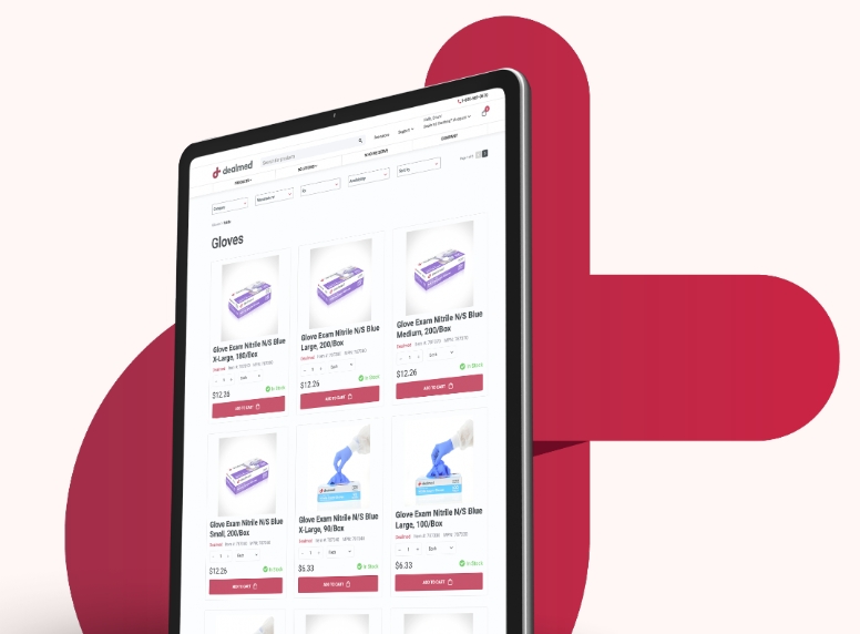
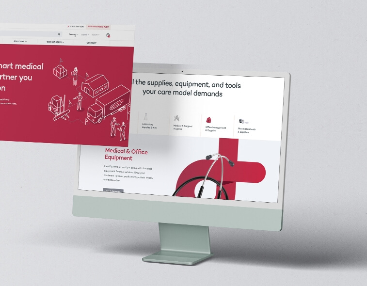
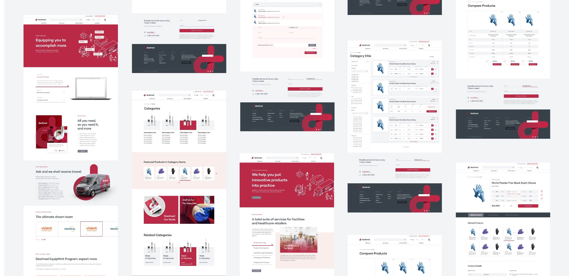
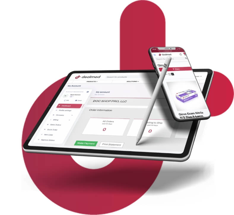
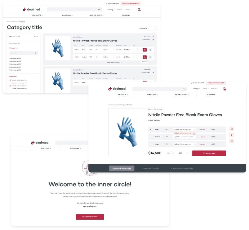
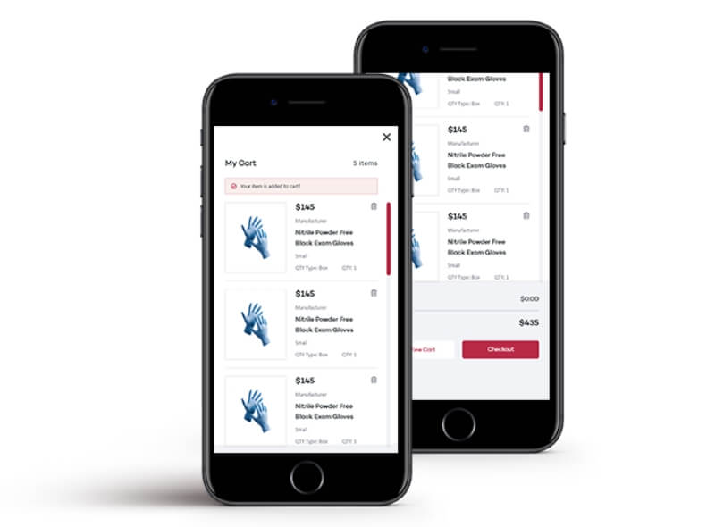
A smoother user experience
Transforming Dealmed’s website from a perplexing maze to a pristinely organized medical supply empire involved tearing down the site structure and starting from scratch.
To make sure the site would be user-friendly and readily adopted, we needed to follow a user-centered design approach. We kicked this off by conducting user research to get a deeper understanding of why the average user was coming to the site and what they were looking to accomplish. We created wireframes and prototypes based on our findings and tested various design solutions to ensure the website would be intuitive and easy to navigate.
To make sure the site would be user-friendly and readily adopted, we needed to follow a user-centered design approach. We kicked this off by conducting user research to get a deeper understanding of why the average user was coming to the site and what they were looking to accomplish. We created wireframes and prototypes based on our findings and tested various design solutions to ensure the website would be intuitive and easy to navigate.
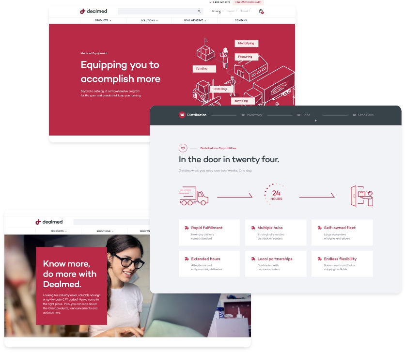
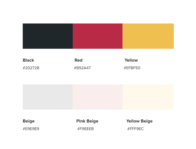
Going easy on the eyes
With the website now having a user-friendly structure, we focused on enhancing its appearance to make it more visually appealing. We mapped out a cohesive visual identity, including color scheme, layout, and typography.
To make the website even more engaging, we added custom illustrations and branded imagery incorporating the Dealmed logo, polished the layout to give off a sleeker vibe, and modernized the overall look.
To make the website even more engaging, we added custom illustrations and branded imagery incorporating the Dealmed logo, polished the layout to give off a sleeker vibe, and modernized the overall look.
From austere warehouse to top-of-the-line superstore
Today, Dealmed has a fresh, beautiful website that truly depicts their scale. They speak in a consistent, clear brand voice that attracts the precise audience they’re looking for and keeps them engaged. The sleek, modern design gives off a stellar first impression. The easy navigation helps users quickly find what they’re looking for, leading to lower bounce rates and increased sales. In short, Dealmed’s new website expertly combines a strong brand identity, aesthetic appeal, and intuitive functionality – making their digital home worthy of the Dealmed name.